You only have to look at new home plans by the major builders to see that the Scullery or Butler’s Pantry has made a comeback.
Originally, a Scullery was a room attached to the kitchen for washing dishes and clothing. A Butler’s Pantry was an ante room attached to a formal dining room to store China, Silver and Crystal [Crockery, Cutlery and Glassware]. Laundries have taken over as far as clothes washing is concerned, while Sculleries or Butlers’ pantries have become extended pantries where preparation and cleaning up after meals take place.
With kitchens now at the centre of an open plan household, the Scullery has become a retreat to hide the mess from the rest of the family, and visitors. Serving as a pantry, they are usually equipped with open shelving so its contents are easily seen and also that a search for a particular item does not involve a lot of opening and closing of doors. There are cost savings too as open shelving is usually more economical storage than individual cabinets.
Before doing an example layout exercise, I’ll start with some basic thoughts on creating a functional kitchen:
Ovens.
When blessed with sufficient space, there is no point positioning any oven under bench requiring bending over to see how things are going and to load or unload. The ideal oven position is with the base just below elbow level. Standing at a cooktop with a front vented oven blasting heat at your torso is no way to spend Christmas morning! And if you wear bifocals, good luck checking out progress without straining your neck!
Benchtop appliances.
Magimix, Thermomix, Kenwood, Kitchen Aid, Blenders, Kettles, Toasters, Coffee Grinders and of course the Coffee Machine. All part of life in most of today’s kitchens. They need to be stored and have somewhere to operate comfortably. Individually, they may be quite handsome, but as a collection, most of us prefer to tuck them away.
Refrigerators.
After the sink & tap, it’s the most used appliance in the kitchen, so it must be located centrally despite its size. It’s doors must be able to open fully to allow access to all areas. You may also wish to keep its contents a mystery to your guests.
Integrated Appliances.
Some folk feel the refrigerator and dishwasher so hideous, they pay extra to hide them behind matching cabinet doors. If that’s the case, a good design could be one where these appliances are not easily seen.
Bench-space / Storage.
A kitchen needs sufficient bench space to perform the tasks of preparation, cooking, serving and cleaning up. However, too much bench space is just as bad as too little when items accumulate due to a lack of proper storage. Benchtop corners are not so good to work on but are useful for placing things out of the way – but it can get messy.
A PRACTICAL EXERCISE
Now, let’s look at an individual kitchen and think through a functional and balanced layout.
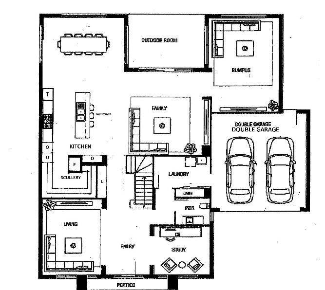
The plan below is typical of a project builder’s design today.

It has a large kitchen with quite a lot of space devoted to its pantry, but less for the tasks performed there. While the layout is only basically marked, we can make out the positions of refrigerator, sink and cooktop.
The door to the pantry opens neatly to the side of the refrigerator recess, but leaves a nib to negotiate when moving from the kitchen bench into the pantry. Shelving in the pantry appears narrower than the benchtop in the kitchen. It seems to function as a storeroom only.
A walk-in linen store backs on to the pantry. This could be extravagant in terms of space consumed, and difficult to use the corner shelf for that type of storage.
Here is my proposed layout for the same kitchen.

By making the linen store, L direct access without corner shelves, it’s still a convenient place for sheets and towels etc. [Although given its proximity to the laundry and bedrooms, a better location in this house should be considered.] The length of useable shelf space is the same, but the overall area consumed is less. The doors are sufficiently separated from the kitchen cabinetry to be louvered or vented, which is preferable for linen. The wall to the right of the linen store is visually balanced with the wall to the left, and is thickened for extra support in this area as in the original plan.
The refrigerator, R, has been placed facing away from the room. Not generally visible, but still central to both the kitchen and scullery. In its place, D, a display area/ bookcase is a comfortable target for the eye.
Two oven towers, O, are opposite the refrigerator. To the right, the convection oven, MW or steam oven on the left. Always avoid placing a front vented convection oven directly opposite the refrigerator.
With a third tower, T, at far right, the cooktop bench is now around 3m long which suits most benchtop material sizes. Deep storage drawers under this bench gives easy access for pots and larger vessels.
The 3rd tower replaces the nib wall. This will avoid all the second guessing around the extent of splashback at a corner, and cornice around the nib wall. Adjacent to the meals area, it will be suitable for crockery and glassware storage.
The dishwasher will be out of sight in the island, or in the scullery. Teamed with a second sink in the now much larger Scullery, preparation and cleaning up can all be done in there leaving the open kitchen for cooking and “performance” tasks on the island. You will only need a stylish single bowl sink on the island.
There is no door to the scullery, indeed it is no longer a separate room. The two oven towers create a break in the bench which screens off the bench in the scullery.
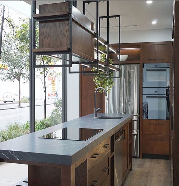
There is plenty of bench space in the scullery to assign to benchtop appliances, preparation and cleaning up. And with so much storage in the kitchen, there’s little need for wall cupboards over the cooktop bench either, just a handsome extractor hood or chimney over a full height splashback, and of course a Gantry over the island!
At this point we have a layout, but not yet a design. When we have completed architectural details and made selections for appliances, colours and finishes, lighting, flooring etc, we can call it a design.

Note that some of this concept is not suitable in homes where teenagers stand seemingly endlessly in front of an open refrigerator contemplating their next snack!
Article and layout by Joel Spencer C.K.D.[AUS]. Joel is principal and the creative force at Casa Cielo Design.

