You only have to look at new home plans by the major builders to see that the Scullery or Butler’s Pantry has made a comeback.
Originally, a Scullery was a room attached to the kitchen for washing dishes and clothing. A Butler’s Pantry was an ante room attached to a formal dining room to store China, Silver and Crystal [Crockery, Cutlery and Glassware]. Laundries have taken over as far as clothes washing is concerned, while Sculleries or Butlers’ pantries have become extended pantries where preparation and cleaning up after meals take place.
With kitchens now at the centre of an open plan household, the Scullery has become a retreat to hide the mess from the rest of the family, and visitors. Serving as a pantry, they are usually equipped with open shelving so its contents are easily seen and also that a search for a particular item does not involve a lot of opening and closing of doors. There are cost savings too as open shelving is usually more economical storage than individual cabinets.
Before doing an example layout exercise, I’ll start with some basic thoughts on creating a functional kitchen:
Ovens.
When blessed with sufficient space, there is no point positioning any oven under bench requiring bending over to see how things are going and to load or unload. The ideal oven position is with the base just below elbow level. Standing at a cooktop with a front vented oven blasting heat at your torso is no way to spend Christmas morning! And if you wear bifocals, good luck checking out progress without straining your neck!
Benchtop appliances.
Magimix, Thermomix, Kenwood, Kitchen Aid, Blenders, Kettles, Toasters, Coffee Grinders and of course the Coffee Machine. All part of life in most of today’s kitchens. They need to be stored and have somewhere to operate comfortably. Individually, they may be quite handsome, but as a collection, most of us prefer to tuck them away.
Refrigerators.
After the sink & tap, it’s the most used appliance in the kitchen, so it must be located centrally despite its size. It’s doors must be able to open fully to allow access to all areas. You may also wish to keep its contents a mystery to your guests.
Integrated Appliances.
Some folk feel the refrigerator and dishwasher so hideous, they pay extra to hide them behind matching cabinet doors. If that’s the case, a good design could be one where these appliances are not easily seen.
Bench-space / Storage.
A kitchen needs sufficient bench space to perform the tasks of preparation, cooking, serving and cleaning up. However, too much bench space is just as bad as too little when items accumulate due to a lack of proper storage. Benchtop corners are not so good to work on but are useful for placing things out of the way – but it can get messy.
A PRACTICAL EXERCISE
Now, let’s look at an individual kitchen and think through a functional and balanced layout.
The plan below is typical of a project builder’s design today.

It has a large kitchen with quite a lot of space devoted to its pantry, but less for the tasks performed there. While the layout is only basically marked, we can make out the positions of refrigerator, sink and cooktop.
The door to the pantry opens neatly to the side of the refrigerator recess, but leaves a nib to negotiate when moving from the kitchen bench into the pantry. Shelving in the pantry appears narrower than the benchtop in the kitchen. It seems to function as a storeroom only.
A walk-in linen store backs on to the pantry. This could be extravagant in terms of space consumed, and difficult to use the corner shelf for that type of storage.
Here is my proposed layout for the same kitchen.

By making the linen store, L direct access without corner shelves, it’s still a convenient place for sheets and towels etc. [Although given its proximity to the laundry and bedrooms, a better location in this house should be considered.] The length of useable shelf space is the same, but the overall area consumed is less. The doors are sufficiently separated from the kitchen cabinetry to be louvered or vented, which is preferable for linen. The wall to the right of the linen store is visually balanced with the wall to the left, and is thickened for extra support in this area as in the original plan.
The refrigerator, R, has been placed facing away from the room. Not generally visible, but still central to both the kitchen and scullery. In its place, D, a display area/ bookcase is a comfortable target for the eye.
Two oven towers, O, are opposite the refrigerator. To the right, the convection oven, MW or steam oven on the left. Always avoid placing a front vented convection oven directly opposite the refrigerator.
With a third tower, T, at far right, the cooktop bench is now around 3m long which suits most benchtop material sizes. Deep storage drawers under this bench gives easy access for pots and larger vessels.
The 3rd tower replaces the nib wall. This will avoid all the second guessing around the extent of splashback at a corner, and cornice around the nib wall. Adjacent to the meals area, it will be suitable for crockery and glassware storage.
The dishwasher will be out of sight in the island, or in the scullery. Teamed with a second sink in the now much larger Scullery, preparation and cleaning up can all be done in there leaving the open kitchen for cooking and “performance” tasks on the island. You will only need a stylish single bowl sink on the island.
There is no door to the scullery, indeed it is no longer a separate room. The two oven towers create a break in the bench which screens off the bench in the scullery.
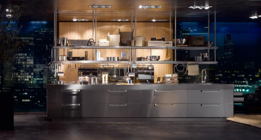
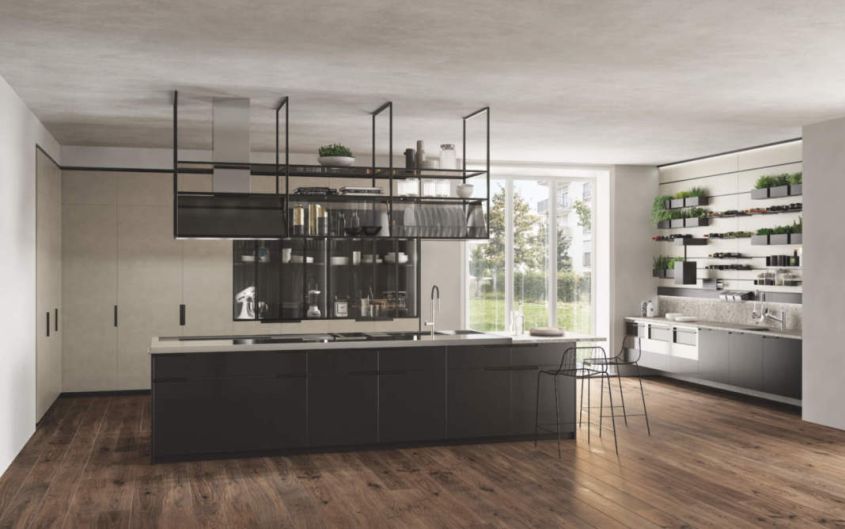
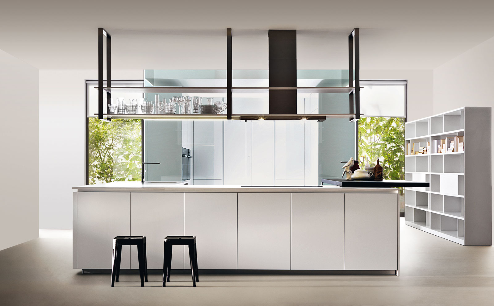
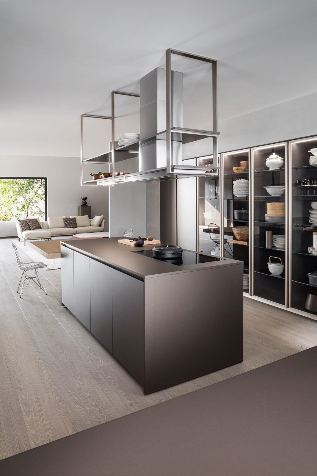
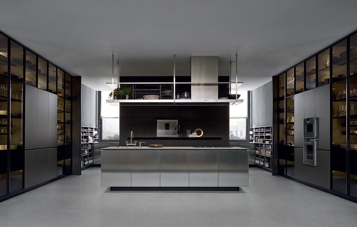
There is plenty of bench space in the scullery to assign to benchtop appliances, preparation and cleaning up. And with so much storage in the kitchen, there’s little need for wall cupboards over the cooktop bench either, just a handsome extractor hood or chimney over a full height splashback, and of course a Gantry over the island!
At this point we have a layout, but not yet a design. When we have completed architectural details and made selections for appliances, colours and finishes, lighting, flooring etc, we can call it a design.

Note that some of this concept is not suitable in homes where teenagers stand seemingly endlessly in front of an open refrigerator contemplating their next snack!
Article and layout by Joel Spencer C.K.D.[AUS]. Joel is principal and the creative force at Casa Cielo Design.
5 Ways to Style Your Gantry this Festive Season
One of the most important spaces in a home is the kitchen, with interior designer Greg Natale believing that “The kitchen is much like the anchor point for the family.” As fewer of us have separate dining areas, increasingly the kitchen has become a spot for hosting and entertaining as well as cooking and food preparation. A gantry is the perfect addition to help elevate your kitchen, not only providing a storage solution, but an aesthetic focal point.
The festive season is officially underway, which not only means decorations are taking over the house, but you’re likely to be opening up the home to visitors. So why not consider how your kitchen gantry can be used to further enhance the festive flair in the home? Here are some tips on how you can style it this holiday season:
1. Lighting
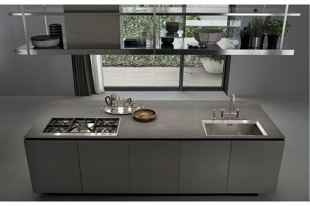
Did you know you can install LEDs into your gantry? The frames are hollow to allow cable to pass. We often see them [Gantries are often] deliberately situated above kitchen islands and lighting is essential for this purpose. Guests very often flock to the island, chatting over a glass of wine while you’re preparing food, so think about how you can install spots or ambient lighting [LED strips or downlights] to create atmosphere while allowing you to read recipes or prep food. If you’re after something more temporary, use the bars and shelves of the Gantry to host some fairy lights for that sparkly, Christmassy vibe.
2. Plants
Plants are able to bring a nice organic element to an otherwise quite industrial kitchen space. Organic or warm tones from the plants and flowers tends to add a beautiful vibrancy to kitchens, especially if you’ve favoured a neutral colour scheme. This Christmas, swap your succulents or fresh herbs for a more festive flair – wreaths, mistletoe, berried ivy or a poinsettia.

3. Hanging Hooks
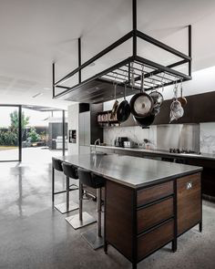
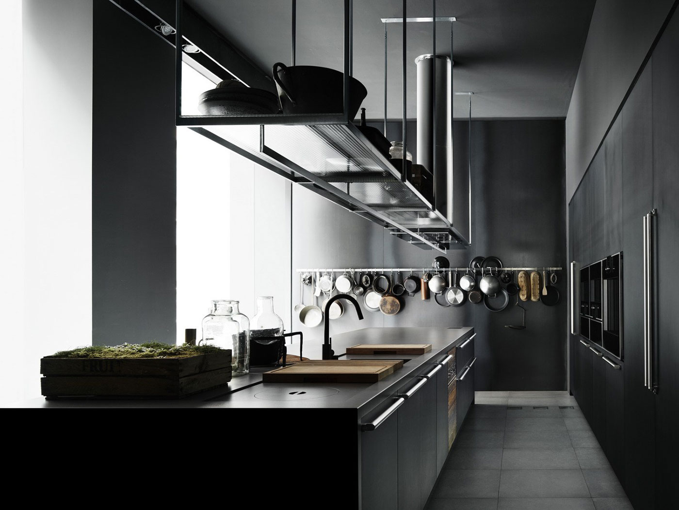
If you have beloved kitchen utensils that you hate keeping locked away in cupboards and out of sight, you’ll love how the Gantry enables the extra space to proudly display items, coupled with giving you that on-trend, modern-industrial ‘cafe’ vibe. Think about adding hanging hooks to your Gantry, turning your kitchen into a sophisticated gallery, likely to capture the eye. Hook rails with hooks are available in our shop-see accessories] Over the holidays, bring out other seasonal items that evoke Christmas dining – a nutcracker, carving fork and get your guests salivating at what lies ahead.

4. Wine Glass Rack
You can personalise your gantry to best suit your personal style, and show off what you love most in your kitchen – and for many of us, it’s all about the wine! Nothing says festivities like having a glass of wine (mulled wine if you’re celebrating a White Christmas, or maybe a gin if you’re in Australia!) with your friends and family. Installing a wine glass rack to your gantry will act as a stunning display piece, enabling you to show off your range of Riedel glassware, or Champagne flutes ready for the [a] bottle of bubbly on Christmas morning.

5. Customisable
The beauty of the Gantry is that you can put your own personal stamp on it – customized to best suit you and your style. There are many ways you can personalise your Gantry dependent on your room layout and size, and personal preference. The brackets are adjustable for height, and length (depending on the chosen version).

The taller variants have stainless steel cross bracing, to stabilise any pendulum swing. Make your Gantry unique to you by using new or recycled timber, perforated steel or glass in any thickness for the shelving. Whether it’s displaying your usual kitchen items, or your special festive treasures, your Gantry is a vehicle for letting your personal style flow this Christmas.
If you haven’t purchased your gantry yet, have a look at our wide range and find your perfect gantry today!
https://casacielodesign.com/product-category/the-industrial-gantry/
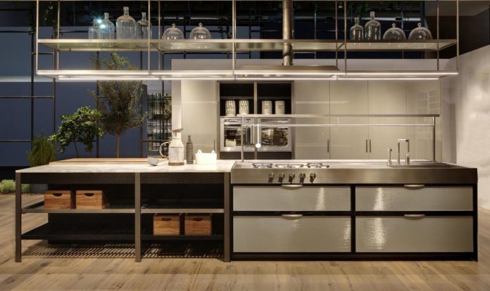
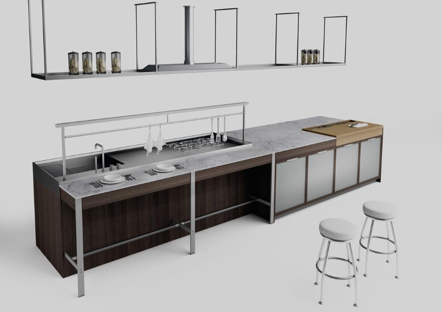
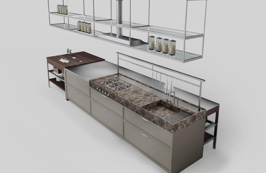
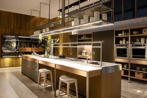
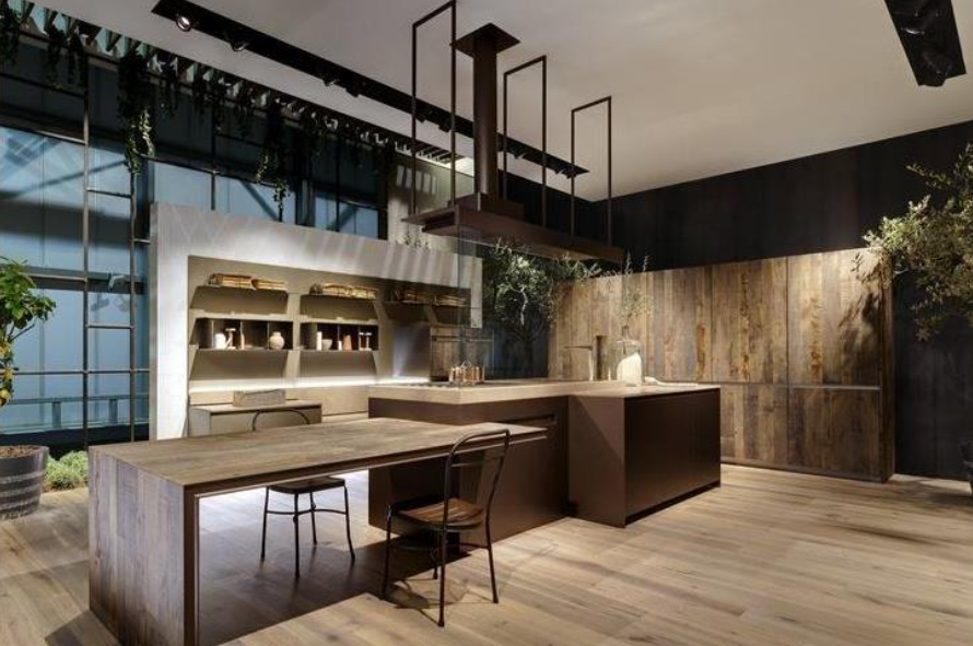
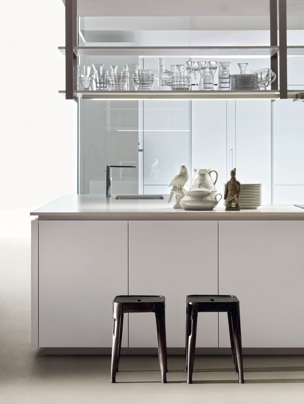
For over a decade, European designers have been using a refined version of the Gantries found in Commercial Kitchens, Cafes and Bars as a way to introduce practical storage shelf over workbenches, the opportunity to incorporate venting, and a place to display glassware, ceramics, plants, and other treasures. With the Gantries offering practical space-saving solutions, they’re also heralded by interior designers globally because of their industrial-chic aesthetic and ability to enlarge a room by drawing one’s attention above eye-line.
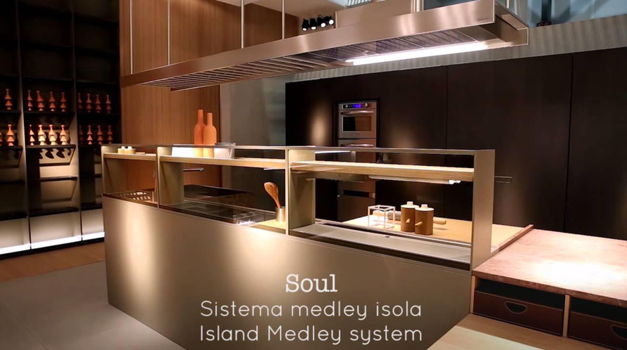
Many Gantries and Gantry Hoods by leading Italian designers and manufacturers were presented at Eurocucina, a biennial exhibition in Milan. Launched in 1974, Eurocucina has become the world’s leading exhibition for kitchen and design excellence, showcasing over 117 companies and a vast array of top-quality products and goods.
At Eurocucina, we’re seeing more trends emerging where consumers and commercial designers are wanting their gantries to be executed with a multi-faceted approach, including ways to individualised the looks using lighting, place of interior décor items, variable shelf options and inclusions of the gantries into streamlined range hoods.
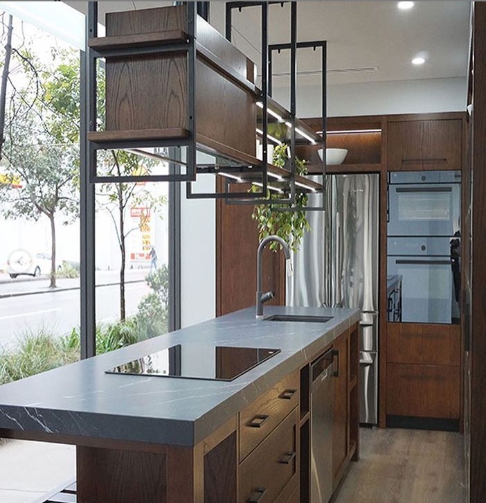
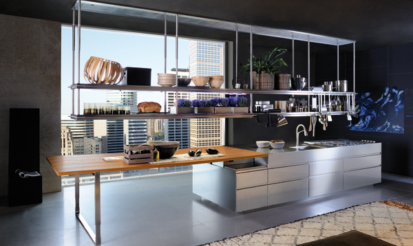
This surge of evolution is a trend that’s still so new just shows how creative and adaptable gantries are for modern kitchens. Our favourite use of gantries that we’ve seen produced from Eurocucina, are kitchens near windows or lovely views installing gantries as a way for the viewer to still enjoy the outside light and surroundings. Unlike cabinetry, that restricts views and demands wall space, gantries are open and transparent, even when full of utensils, bowls or décor. This allows for people, especially those who might be situated in apartment buildings where light is advantageous, to have the best of both worlds in the battle of light and storage.
At Casa Cielo Designs, we know the importance of design coupled with functionality, alongside affordability firmly in mind. Our Gantries are adaptable and can be configured to suit almost any space. If you’re looking into purchasing a Gantry for your kitchen, we recommend browsing our most popular options, like our 1.8m wide GI-2 Gantry, or our GTI 1 Gantry, with two shelves and plenty of storage depth. All of our Gantry selection can be viewed here, and feel free to contact us directly on our email at sales@casacielodesign.com
We’ve personally selected some of our favourite examples of gantries that were showcased at Eurocucina to provide examples of high-standard gantry use and the modern, sleek kitchens that they accompany.
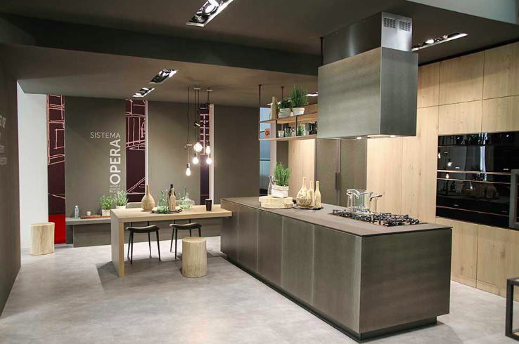
ERNESTOMEDA


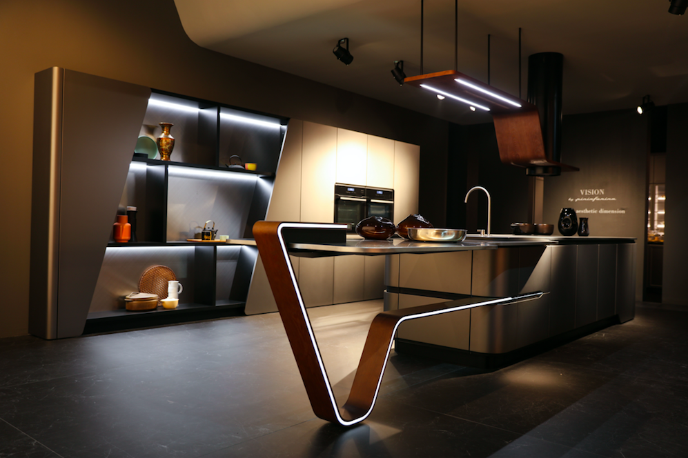
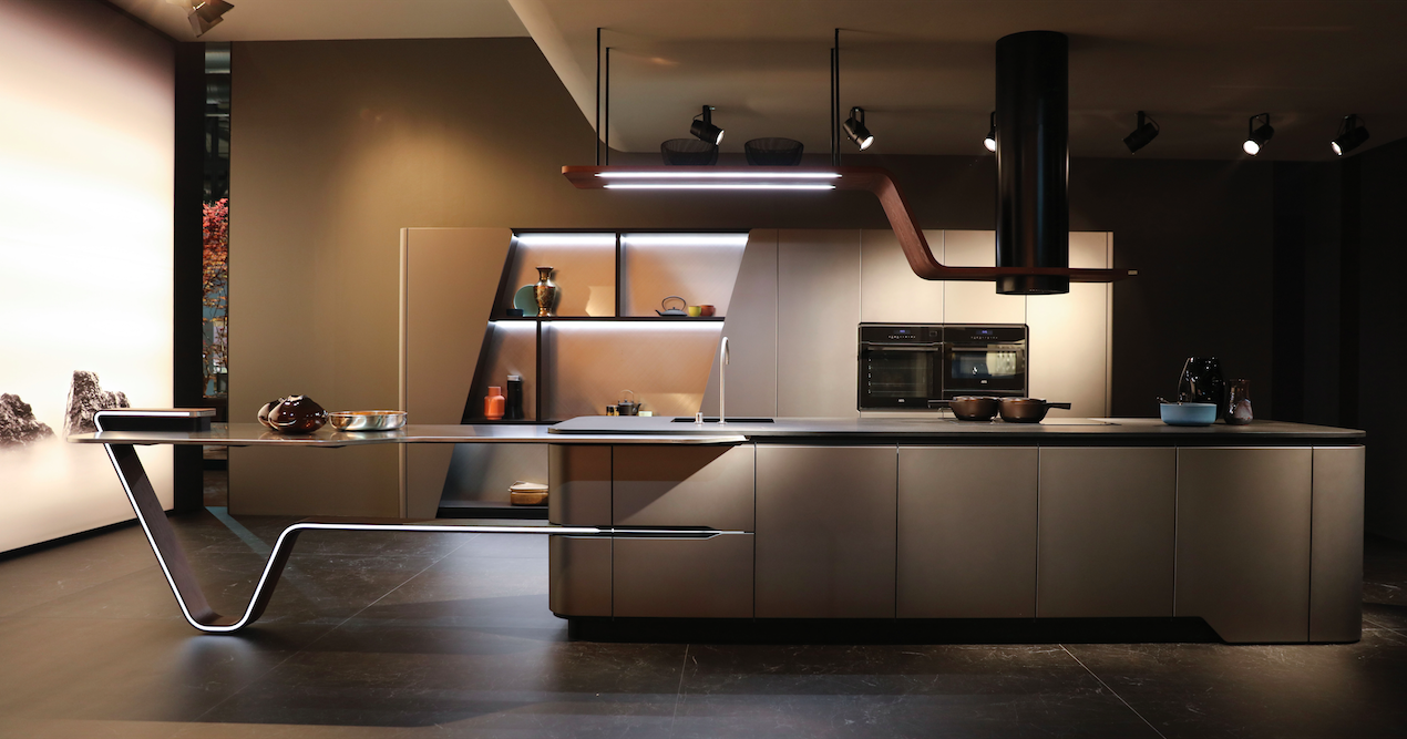
SNAIDERO – VISION BY PININFARINA


Turn kitchen culture on its head and think about how you can creatively indulge in this upcoming trend in 2019! If you’re ready to modernise your kitchen, personally or commercially, consider a gantry as a smart, on-trend and useful addition to your space. And while you’re brainstorming, feel free to ask us about how Casa Cielo Designs can help you achieve your custom dream kitchen.
About Casa Cielo
Casa Cielo Design, based in South Australia was founded by kitchen design innovator, Joel Spencer in 2018, with a view of creating attractive and functional yet affordable storage solutions for the home. Its hero product is The Industrial Gantry, a skeletal shelving system suspended from a ceiling to store equipment., which can be configured to suit any kitchen, and self-installed.
www.casacielodesign.com
www.facebook.com/casacielodesign
www.instagram.com/casacielodesign/


